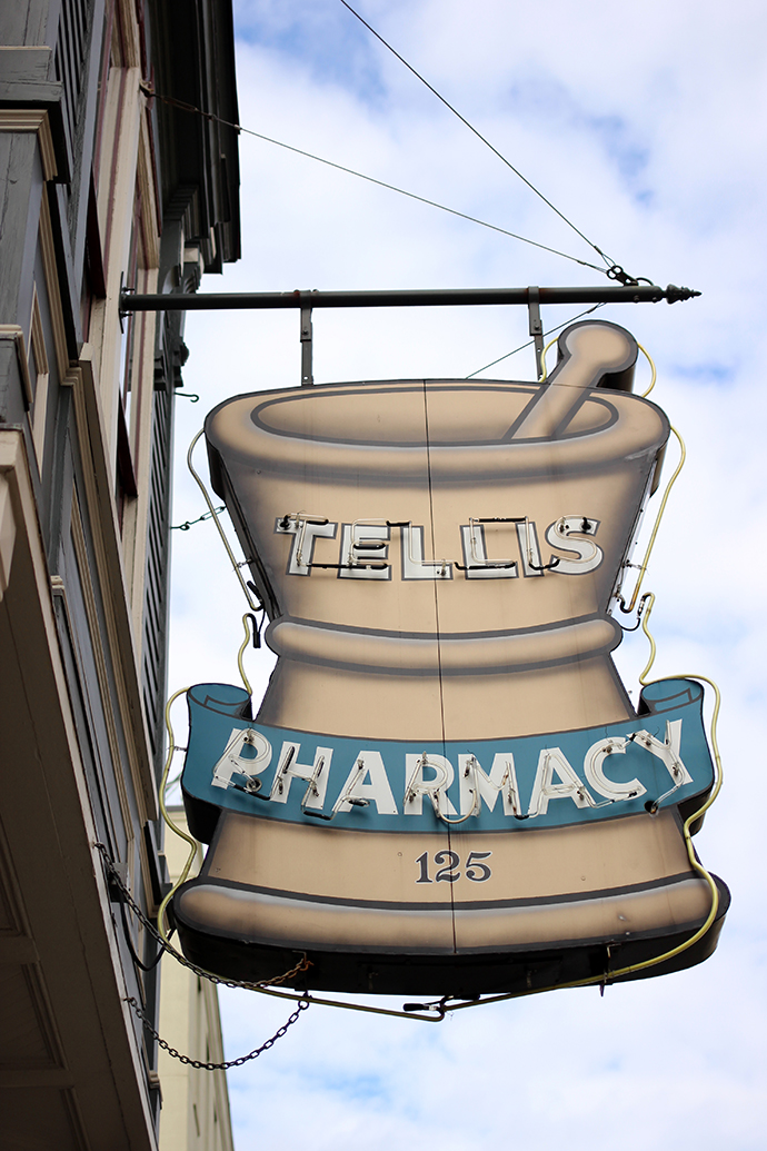
Charleston: Signage

I noticed as I was going through my photos from our recent trip to Charleston that I had so many photos of beautiful signage. I'm a graphic designer by day, so I'm programmed to notice nice lettering, and no matter where I go you can bet on me being drawn to good signage. Charleston was full of wonderful hand-painted signs, beautiful scripts and even a few neon goodies.


On our mini-road trip, we passed a roadside shop, which we stopped at following our exploration of the Old Sheldon Church ruins. Although we were lured in by the promise of pie, they didn't have many—but they did have a wide variety of ciders and other tasty treats. We sampled everything we could, and I left with an armload of souvenirs (which I mostly ended up eating myself).


Many stores (especially on King Street) had beautiful, tiled entryways spelling out the name of the store. Most of the time the names no longer matched the store occupying the space, but it's such a wonderful touch—and show of faith in a retailer's longevity—that's really missing from modern-day storefronts.


Of course I took special note of the funeral homes, of which we saw several. The wording "home for funerals" is phrasing I don't ever remember seeing before Charleston (maybe it's a Southern thing?). Don't iron curlicues instantly make a sign look important and a bit old-timey?


We didn't see as much neon in Charleston as you see in New York or other cities, but that script on the American theater marquee is just about as perfect as you can get. I know we're not supposed to judge books by their covers, but I'm not embarrassed to admit that a lot of my decisions in life are based on how something looks—I'll frequently purchase something based on superior packaging (all of other things equal) and I've eaten at countless diners based solely on signage. This isn't a foolproof method, of course, but I figure there are worse ways to go through life than being guided by beautiful design.
