Florence: Signage

Even after having more than a year to reflect on my Italy trip, it's impossible to pick a favorite of the five cities my uncle took me to. However after five days in Rome, I do remember thinking upon arriving in Florence that I was going to like it even more than I did Rome. I was right, although it's unfair to compare two (or five) very different cities. Florence is smaller and felt intimate and carefully curated, which was a nice tonic to the overwhelming amount of very important things to see in Rome.


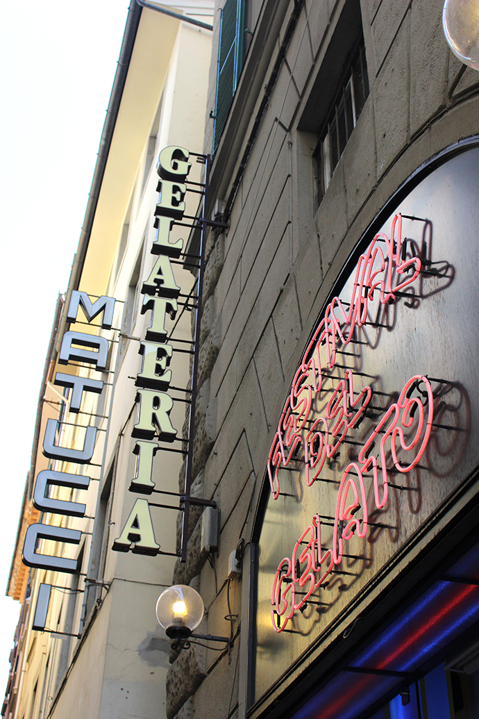
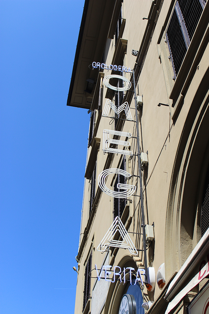
Florence probably had the best signage of the five, a category that saw a lot of robust competition during the course of our trip. Every hotel, gelateria, restaurant and store had a lovely sign, most of which comprised individual letters, stacked vertically and suspended perpendicular to the building.


No matter what they said—I could figure out most, but I don't speak Italian—or which way you saw them from, they were all wonderful. There were illuminated letters, neon scripts and such a lovely variety of colors, arrangements and typefaces that I was constantly stopping to photograph run-of-the-mill shop signs like the big, embarrassing tourist I was/am. I know everything sounds exotic and better in a language that's not your own, but it's very hard not to prefer "Coiffeurs Pour Dames" over Best Cuts.
